I’ll change a bit the general topic of this blog today by talking about general electronics. But this is not entirely off topic: smart tvs and set top boxes have one general issue they need to solve: it’s how to become simpler. What people like about their TVs is that they don’t have to go through a painful process to watch their favorite show. Press the right channel on the remote control, and usually you’re done.
Smart TVs and set top boxes kind of take that away: they offer more content, a richer experience, but are not as “simple” to use as a TV. And this is one of the major things that people complain about. I don’t. I like the flexibility offered by a vanilla Android on my set top box, the Cloudnet Go CR11, but I understand it’s not for everyone.
As you may or may not know, I live in Japan. I use electronics in my everyday life, and after spending 9 years in this country, I am now convinced that something is completely wrong with how electronics are designed in Japan today.
Domotics and home automation are supposed to make my life easier, not more complicated. But most electronics in Japan have such a complicated interface for no good reason, that they completely defeat the purpose of having a machine in the first place.
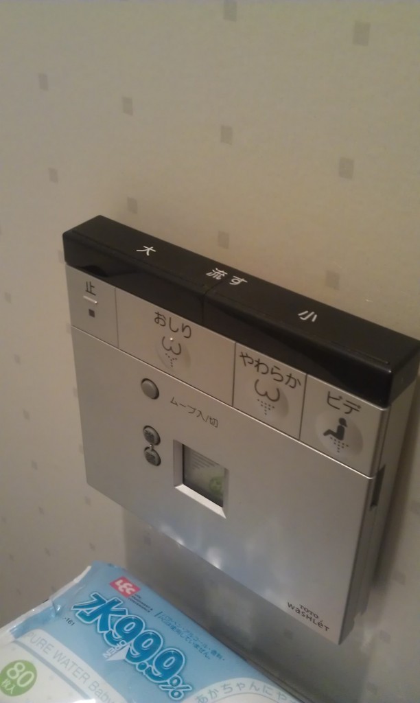
you might have heard of the Star Trek-like Japanese toilets, they are pretty famous. Below is what the panel of my toilets looks like. There are 9 buttons on this thing. It looks futuristic, but in reality, it’s annoying. This thing should be simpler.
The toilets are definitely not the worse. Below is the panel that controls the temperature of the bathroom. In my experience, to control the temperature, there should be a plus and a minus button, and maybe a power button. This thing has 11 buttons, 15 leds AND an additional display. Why, Japan, why?
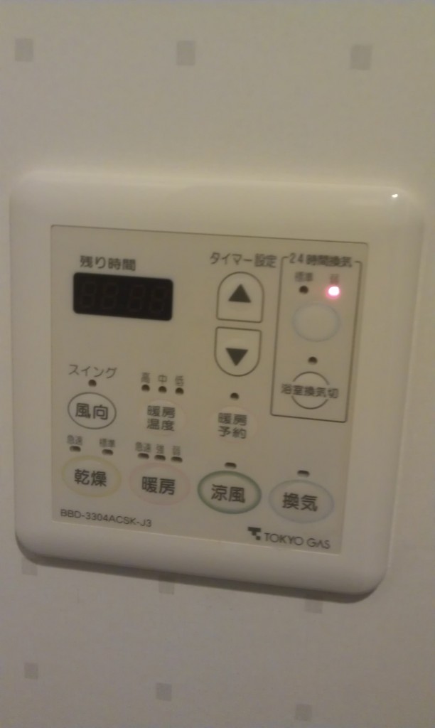
The Japanese readers among you might call me out on the panel above, and explain to me that it also has other functions such as the fan speed and stuff like that. Whatever, it really shouldn’t be that complicated. But fair enough, let’s look at the next example.
The picture below is an air humidifier. Don’t be impressed by its monolithic design, it’s a f#cking wet towel that rotates in front of a fan, I’m sure you’ve seen those before.
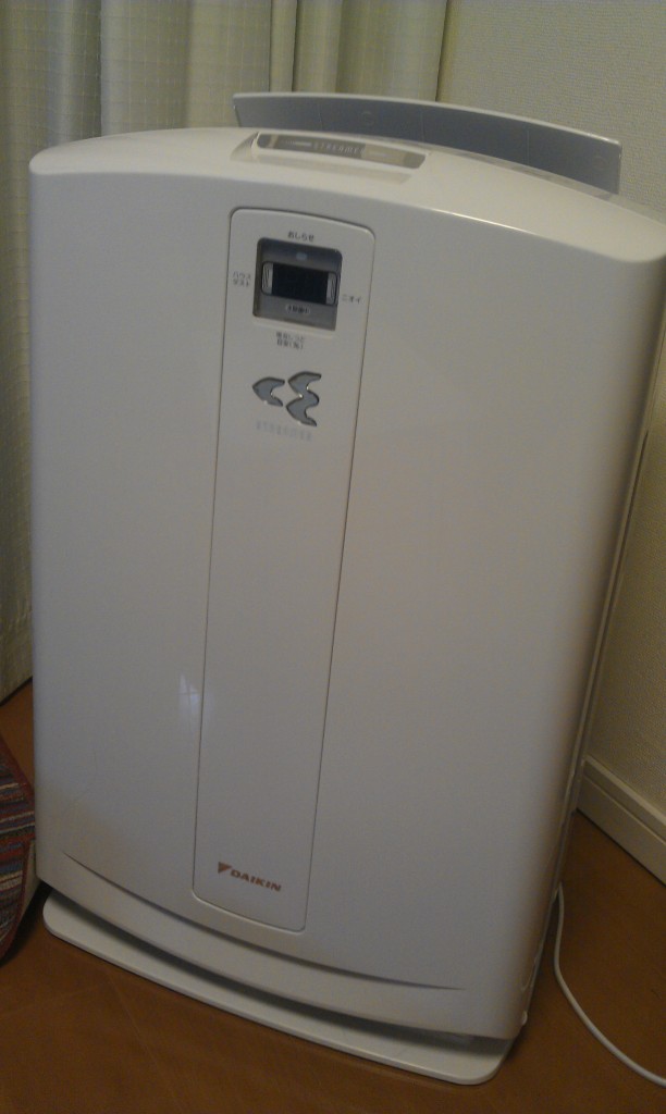
Now let’s look at its control panel:
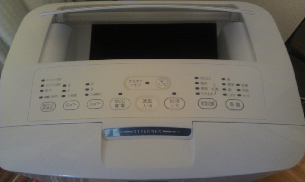
9 buttons, 22 leds, plus the digital screen shown on the previous picture. For a towel that rotates in a bucket of water! Shouldn’t there just be an “on/off” button here? It looks like a freaking company-grade printer! also look at the “ECO” button. All Japanese appliances have this stupid functionality added one way or another. ECO is cool, it makes your customers believe that you care about the planet. Come on Japan, just be real engineers, and make the device eco from the ground up, without me having to push a button!
This is the control panel for our fridge. It has 6 buttons, each one with up to 5 modes, depending on long presses, short presses, and how many time you press the button. It’s a giant clusterf#ck.
Still not convinced? let’s have a look at the following remote controller:
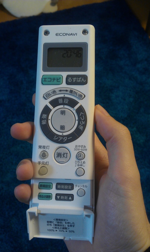
What the hell can this be? This is the remote controller for the light bulb in my living room!!! 18 buttons for a light bulb! What a great, intuitive, user friendly interface. (also, notice how it is “ECO” once again)
Now let me show you an appliance with a design from the US (and for those who ask, no, I’m not American)
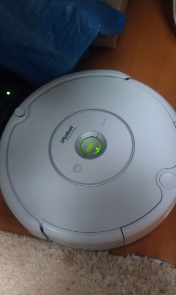
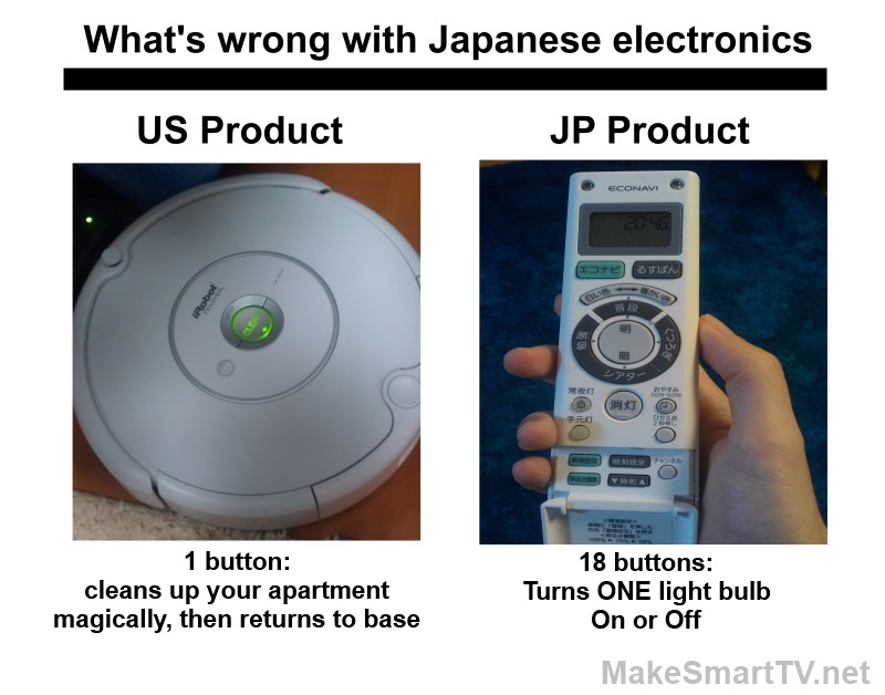
Introducing the Roomba. This thing has one single button. Not 18, not 5, one! When you press it, the device cleans up your entire apartment, magically. It doesn’t ask you if you want ECO, if you want it to go in circles or in straight lines, if you want its sucking power to be 123, 235, 368, or pi r squared. It just does the job that it’s made for, then comes back to its base! It frees you from a repetitive and boring task, fulfilling the reason home automation was invented.
Now have a look at the light bulb remote controller again, and compare. Most of the buttons on that controller do nothing in most cases, they all have dependencies on each other. It’s useless to click button A if you’re not in mode X. It’s impossible to understand even for people who can actually read Japanese. The whole thing is nerve racking.
My 3 year old kid can use the Roomba to clean up our apartment, but he can’t turn the lights on.
This is how late and disconnected from reality Japanese electronics are today.

Comments
4 responses to “What’s wrong with Japanese electronics today”
You gotta find the right balance.
wouldn’t it be easier to give us a simple lay out of need buttons and then a option to customize with a USB and a computer like a Logitech remote. they have for years made it so it can be as complicated as you wan it to be or as easy as pie. Customization is fine but not all of us are I T nerds LOL i see your frustration and also see the need to dumb it down a bit LOL. good luck to you and all your fellow Japanese citizens.
You know there’s a significant difference between a Japanese brain & an American brain. 😉
There is also a major difference in the general public of America, England (where I’m from), and Japan itself. Japan’s society are more towards customizability & features, whereas American’s are after simplicity & ease.
Japan are noted in history for their great brands, reliable, sturdy, expensive; but long-lasting technology that you can be assured is of high-quality grade. China would happen to be the opposite, but that’s an entirely different aspect of this argument.
The Japanese general public have proved significant demand for the order of the products that you’ll see are common in Japan, simply because the statistics for what they desire are higher for the general public of Japan for the majority. But if you look at American obesity and compare it with Japan, then feel free to start a debate on that.